After making all these paper cuts, I have decided that this will be technique i will use for my final piece(s). I want to have 3 A3 size pieces, each with a quirky image of a pregnant woman. The pregnant females will all be a small size, and maybe unrealistic proportions. This relates back to the documentary I watched (the truth about super skinny pregnancies). I will have some floral detail around them, this is to represent the natural aspects of pregnancy.
In terms of the colours I will use, will also relate back to my research. I want to use blue, like some of the images i found right at the start of my research. This colour will show peace and calmness around the unborn baby. I will use pale pink colour, almost like the colour of skin. This will be to show how natural pregnancy is. Also, I will use a bright pink colour, very illuminous. This will bring the pop art/cartoon/clip art effect that i have looked at in my research.
All of these colours will contrast each other, yet work together really well. I have found the card I will use. It is very thick and strong, perfect for a final piece. The colours all have a metallic effect and when the light shines on them, it looks beautiful.
As for the designs, I will draw them all free hand. I will base them on some images I have recently been looking at but give each of them their own twist and individuality. Because they will be paper cuts, I will be using a knife for all of it. Also, as i will be making stencils, i may re-use parts of the designs over again, as I done similar to this in some previous work building up to my final piece. I may also use some acrylic paint to add some detail to certain things. I don't feel i can plan every last aspect to my final piece, I want to be able to create it freely, and do what i want to do while I'm doing it! If I want to change anything about it while I am creating it I will, I don't want to restrict myself with what I can create.
05 May 2011
07 April 2011
My Own Paper Cut Designs
I found some designs i like from the internet and drew parts of them onto white paper creating my own design. I then cut through the white paper and the dark plum coloured paper, creating two stentils. I put yellow card behind this stencil, and I think the two colours contrast really nicely.


I done the same with this design. I do like this one better because the pattern is more intricate and detailed. The colours in this one relate more to some of my previous work, however the contrast isnt quite as strong as my other cut out.


This is another advantage of doing the cut outs. You get a beautiful stencil at the end, which could be used for other techniques such as screen printing. Here I have backed it onto black card, The effect is not as nice as the coloured one, so I could try and experiment more with it.

This design was made from the pieces that i cut out of the original image. I have arranged them differently only a lilac piece of card. I quite like this effect because its the same colour in different shades. It has a neutral, pleasant look to it. I really enjoyed doing these paper cuts because from doing one, you can create numerous pieces of work.


This is my stencil I created from this cut out. I have placed it up side down on a piece of black card. I think I will create some screen prints with this one too.

This third cut out was created with silver shiny paper put onto a bright pink background. I do like the effect of the shiny paper, as you can kind of see a reflection of me taking the photograph of this peice of work. This image could be inproved by adding some more detail.


This second piece of work was created from the stencil that was produced from the original cut out, and I added some simple, unique designs to make it look more detailed and the colours I have used work really well together in my opinion.

This is an image I made from the two previous paper cuts. The brown paper gives a lovely contrast against the blue and green. Producing all of these images has got me thinking about my final piece, and that I could use this technique in the work I show at the exhibition.
03 April 2011
My own designs.
From using what I have found so far, I have created some of my own designs.


This is the first image I created using acrylic paints. I am pleased with my choice of medium because it has given a bold effect, however I would like the detail to be more intricate and neat. This image reminds me of the work of Henri Matisse and his paper cuts.

Henri Matisse was a French artist well known for his use of colour and his originality. During the last fifteen years of his life, he developed his last artistic 'triumph' by 'cutting into colour'. His technique involved cutting free hand into coloured paper creating beautiful shapes which he then pinned to the studio walls.


Henri Matisses work pushed the boundaries of conventional painting, drawing and sculpture. Later, the cut outs were glued onto large white pieces of paper for shipping or display. I like Matisses cut out because I think they look quite abstract and colourful. By looking at his work it has inspired me to create some of my own paper cuts based on pregnant figures and some intricate pattern designs.

I drew this image using soft chalk pastels. i started by creating some abstract flowers for the background and then added bold black lines to create the shape of a figure. I enjoyed doing this piece of work, however i dont think the background and the drawing work well together. This was an experimentation with a different media, I have decided that I dont want to develop this technique any further.

This is the first image I created using acrylic paints. I am pleased with my choice of medium because it has given a bold effect, however I would like the detail to be more intricate and neat. This image reminds me of the work of Henri Matisse and his paper cuts.
Henri Matisse


Henri Matisses work pushed the boundaries of conventional painting, drawing and sculpture. Later, the cut outs were glued onto large white pieces of paper for shipping or display. I like Matisses cut out because I think they look quite abstract and colourful. By looking at his work it has inspired me to create some of my own paper cuts based on pregnant figures and some intricate pattern designs.
29 March 2011
Pregnancy Henna Tattoos
While i have been researching, I have been repeatedly coming across images of women's pregnant bellies who have had henna tattoo designs all over them. I never realised how popular it was to have this done. I have looked at lots of different designs and these are some of my favourites.


This henna tattoo is by Heather Providence. She is a professional henna artist. I really love all of the intricate designs these henna tattoos have, and i think i could incorporate some of them into my own work. The designs can be really pretty and unique, and i enjoy drawing patterns like these.
25 March 2011
Some Of My Own...
After looking at some of these images that are in a pop art kind of style, this inspired me to create my own pieces of work. I used some images I found to give me ideas for colour and the designs for them.


This is one of the images I created. I really like the colours I have used because the mix of pinks and purples work really well together. The colours in this painting are meant to go from dark at the bottom fading to lighter shades at the top. However, especially while painting the body, this was easier said than done! I found the acrylic paints I used were too think even when I watered them down. It was very hard to create a gradual change in colour. Next time I will use something easier to work with like water colour paints.

I painted this image also using acrylic pains. I think this one was successful but again i had the trouble with the acrylic paints being too thick. I thought they would be fine to use as i was just doing block colour, and it worked everywhere except for the dark purple figure. It was hard to make the colour look smooth and even all over.
I painted this image because I thought i was quite an unrealistic figure of a pregnant woman. However, I do really like the style of this image and i will work more into this kind of work.
15 March 2011
Summary Of My Project So Far
Through researching and looking at the ways in which pregnancy effects the mother by the growth of the baby has bought me to looking at different figures. So far i have learnt that many different bodies deal with pregnancy in different ways.
I have started to look at un-realistic pregnant bodies that are shown through art, for example, clip art and items such as pregnant barbie dolls! I want to look more into this and i will start to create some drawings using my own interpretations of what i have found.
I have started to look at un-realistic pregnant bodies that are shown through art, for example, clip art and items such as pregnant barbie dolls! I want to look more into this and i will start to create some drawings using my own interpretations of what i have found.
08 March 2011
Some Images That Caught My Eye
 I really struggled to find some images of pregnant women illustrated in a pop art style, however by trying to find them i found some other images that caught my eye and i think they give a fresh, more contemporary look on pregnancy.
 This first image of four ladies all pregnant and it is called 'Las Vegas Moms'. I like this image because all of the colours being all florescent. However, i dont think they give a realistic image of a pregnant woman. The rest of their bodys other than there stomach doesn't look like it is in proportion. It reminds me of clip art.
This second image is from www.flickr.com. It is a one off and i love it! It is an image based on a photograph and its is called 'Maya pregnant'. I think this image looks really graphical and i love the small  use of colour that contasts the black and white figure. This image looks like it has been stencilled, and the style of it really reminds me of the work that Banksy did. I went to have a look to see if Banksy had done any work that relates to my pregnancy theme and this is what i found. This is called 'Danger Monkey Pregnant Woman'. I do like this image because it is so different from everything I have looked at so far.
  The body of a woman and the face resembling the features of a cartoon style monkey, i would really like to know how and why Banksy did this piece. I cannot find any information on this piece of work, but I like it because of its originality. All of these images have given me ideas for the next stages of my project. Before I went to continue this on, I found an image called 'Medicine and Pregnant Woman'. This image looks just like my paintings showing a woman at five and seven months pregnant! Even the colours are very similar. However I do still like my paintings better and I don't like the blue background on this image. This image is showing a lot of the medical sides to pregnancy.

 use of colour that contasts the black and white figure. This image looks like it has been stencilled, and the style of it really reminds me of the work that Banksy did. I went to have a look to see if Banksy had done any work that relates to my pregnancy theme and this is what i found. This is called 'Danger Monkey Pregnant Woman'. I do like this image because it is so different from everything I have looked at so far.
  The body of a woman and the face resembling the features of a cartoon style monkey, i would really like to know how and why Banksy did this piece. I cannot find any information on this piece of work, but I like it because of its originality. All of these images have given me ideas for the next stages of my project. Before I went to continue this on, I found an image called 'Medicine and Pregnant Woman'. This image looks just like my paintings showing a woman at five and seven months pregnant! Even the colours are very similar. However I do still like my paintings better and I don't like the blue background on this image. This image is showing a lot of the medical sides to pregnancy.
The Development of Pregnancy
I have looked at the development of pregnancy, what happens when the baby grows and how it effects the mothers figure.

These four images show what I have learnt from finding out at what stages have the biggest changes over the nine months of pregnancy. The first image and the last image were made from screen prints, and the middle two i painted using acrylic paints.

This screen print shows the baby's growth and the mothers figure at 3 months pregnant. This is when you can first notice the bump. It varies on different people but this is when I can see the most significant changes to the growth of the baby. However, the piece of work was unsuccessful in my opinion! The outline is not neat, I think this was due to me applying too much paint. Also, because the foetus at this stage is so small, it was hard to create a small, neat print.

I painted this with acrylic paints and it shows the mother at five months pregnant. I much prefer the painting more than the screen print because it looks much neater and the colours are brighter. The baby is also a lot more developed over just two months.

This image is showing the seventh month of pregnancy. The figure is a lot more 'curvy' than earlier in the pregnancy. Also, again i am a lot happier with the painting than the first screen print. The baby is a lot bigger, making the mothers stomach bigger, and also the breasts enlarge.

This is showing the mother in her final stage of pregnancy, the nineth month. I created this using screen printing, and I think it is much more successful than my first screen print. the outline of the figure is very neat, even the foetus is clear and you can really see the shape of its body. The foetus is almost ready to be born and the mothers figure is at its most curvatious.
By doing this sequence i have learnt more about the ways the body changes throughout pregnancy. I think the colour of the paintings is very important to me. The reason I chose blue in the back ground of the image and the background of the womb is to show a relaxing enviroment for the foetus and the portection it has in the mothers body. I think it could be interesting if I was to play around with the colours more, because especially from the screen prints I think my images have a slight cartoon feel to them.
 I found a DVD in the student library called 'The Truth about Super Skinny Pregnancies' starring Louise Redknapp. Louise Redknapp rose to fame while in the girl band 'Eternal' and since then she has hosted t.v programmes and she knows all about fashion and how much pressure people are under to look good. She made a documentary while she was 8 months pregnant right up to a photo shoot she had in her underwear just 6 weeks after giving birth. She investigates the pressure on women to maintain a glamorous pregnancy, and the reasons people want to get rid of the changes to their body by pregnancy so quickly. She met new mums, and mums-to-be that have been influenced by the stories they read in magazines and the pressures they face to get their original body shape back.
Louise Redknapp met one lady who had 'pregorexia' and interviewed her. 'Pregorexia' is a name doctors have given to women who suffer eating disorders during their pregnancy. This lady in particular had only gained 8 pounds throughout her 9 months, and the average woman puts on 1.5 - 2 stone. Approximately one in twenty women will suffer from pregorexia. She also met with another woman from America who under went surgery to get her figure back. This just shows how important it is to some women to be a 'yummy mummy'!
I felt that this DVD has related to my project because a lot of the images I have looked at, and are going to look at will be focusing on the 'perfect' pregnant figure, and maybe some unrealistic ones. Louise Redknapp showed the viewers that it is possible to get your figure back, or very nearly back to normal after just 6 weeks.
Although I really enjoyed watching this DVD and finding out about the pressures some women feel they are under, I would like to move away from the serious aspects of pregnancy, and look at some of the fun, enjoyable illstrations and images.
01 March 2011
An Artists Double Life
While i was researching on the internet, a couple of times i came across a lady called Andrea Fryer. Although this post doesn't have much relation to the others, i found what she done really intriguing.
 Andrea Fryer, on the 15th December 1997, when she was 8 months pregnant she crawled into a large black box and pushed her pregnant tummy out of a hole with a huge gold frame around it. She had exposed her big naked belly to the public to be listened, watched, tickled and patted for two hours.
 Fryer came up with is idea while she was studying in her third year of a media arts course and she couldnt understand installation art and how it differs from 3d sculptures. Her teacher showed her some images of famous installation arts, meanwhile she could feel her baby moving in her belly. This is when she thought to herself 'now thats a REAL work of art - an unborn baby'. Her thoughts gathered and then eventaully she told her teacher her idea and went on to thinking about how this could be done.
The final piece was held at the Sara Hilden Art Museum in an exhibition called 'My picture Your picture' which was there for nearly four months. It was a childrens based exhibition which was why it fitted in perfectly.
The final piece was held at the Sara Hilden Art Museum in an exhibition called 'My picture Your picture' which was there for nearly four months. It was a childrens based exhibition which was why it fitted in perfectly.


25 February 2011
Pregnancy paintings by Alice Neel
Alice Neel was one of the great American painters of the twentieth century. She painted people, landscapes and still life and she had her own distinctive style. She said 'painting was more than a profession, it was more of an obsession, I had to paint'. Neel completed paintings with all different types of subject matters, but the ones of the pregnant women were obviously the ones I wanted to focus on, and personally I think they are the best ones anyway!


Three years later, this oil on canvas piece arrived. It was made in 1971 and it is named 'Pregnant Woman'. Even though this image only arrived not long after the last one, I think this has a more modern feel to it. The colour looks clearer and not as dull, the painting as a whole looks brighter. I do like that there is a male in this one too, however I think he looks slightly frightened or curious, seeing as he is only peering over the sofa at the woman.

This image is called 'Pregnant Maria'. It was created with oil on canvas in 1964. This is the earliest painting I could find of a pregnant woman by Alice Neel.
This image, also completed in oil on canvas is called 'Pregnant Julie and Algis', 1967. I like this image more than 'Pregnant Maria' because not only is there a male figure, but the image as a whole is brighter and there is more to look at as it is also 'busier'.

One year later (1968), this image called 'Pregnant Betty Homitzky' was made, again by oil on canvas. I don't like this image as much as the one made in the previous year, it doesn't look very interesting or eye catching. Also, the woman in the image doesn't look like she is as far into her pregnancy as the last two, therefore it takes away the point of the painting in the first place.

Three years later, this oil on canvas piece arrived. It was made in 1971 and it is named 'Pregnant Woman'. Even though this image only arrived not long after the last one, I think this has a more modern feel to it. The colour looks clearer and not as dull, the painting as a whole looks brighter. I do like that there is a male in this one too, however I think he looks slightly frightened or curious, seeing as he is only peering over the sofa at the woman.

This is the last and latest oil on canvas painting of a pregnant woman by Alice Neel I could find and it is named 'Margaret Evans Pregnant'.
I like that all of these paintings are still life ones, however, personally I think I am just not too keen on the style of her work. It is quite old fashioned and I prefer the contemporary work of people such as Tina Bolton. Although i do not like Neels style of painting, I do like how graphic she has made them. I am the kind of person that thinks a pregnant body looks beautiful with a large bump, however these images have made the women's body look out of proportion, and generally not nice. Maybe Alice Neel wanted to give the viewer this reaction? Maybe she wants to show the negative changes to the female body through the later stages of the pregnancy.
Tina Bolton - Pregnancy Photography
In 2009, Tina Bolton was the pregnancy photographer of the year. She is one of the leading specialists in pregnancy portraits and she succeeds in continually pushing the boundaries to create the most fabulous images for a mother. She believes that the pregnant shape is 'simply beautiful' for so many reasons, and a photo shoot is the best was to celebrate it.


I absoloutly love these photographs by Tina Bolton. These are just three of the many she has taken, and all of them are simply beautiful. I think all the images are very intamate and they reach the clients on a personal level. The effect of the colour she has put on them gives them a 'fresh' feel. The first image is especially eye catching where it is all in black and white except the matierial shes using to cover part of her is in colour. I really like how all the photographs have a natural feel to them, like their showing how pregnancy is the most natural thing in the world.

17 February 2011
My concept and what i have found.
I have been looking online to find information and ideas to go with my concept of figure and form - pregnancy. As i am quite fond of printing, some prints on the website www.pregnantearth.com really stood out to me. These are fine art prints that are for sale.

I like this image because you can see the baby inside of the womb, and the effect of the blue background of the body reminds me of a sea and its like the baby is in the ocean. This portrays a calm, peaceful environment for the baby. However, having the black background gives a dark and mysterious feel, I prefer images that are brighter.

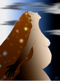
I really like this image due to the contrast of the colours. To me it looks like the woman is sitting in the moon, blowing out stars. This gives a magical effect, perhaps showing how magical pregnancy can be. I like the use of line in this print, the figure simply being shown by black lines gives a graphical look.
I really like the use of line and colour in these pieces of work. This is something i want to look more in depth at. Also, i think they have a pop art feel to them. Finding these images is a definite starting point for me. I look forward to producing some of my own prints in the style of these ones. Some parts of these images have digital and water colour aspects of them too.
Subscribe to:
Posts (Atom)